Green Loop - hero
Green Loop - diagram

Trift & swap mobile app

Green Loop - application advertisement

Trift & swap mobile app

Mobile swap app focused on creating a smooth, safe, and effortless experience for both buyers and sellers, blending a clean interface with subtle Gen Z-inspired elements to make second-hand shopping feel intuitive, trustworthy, and appealing for users on both sides of the exchange.

UI DESIGN
UX
COPY
BRANDING

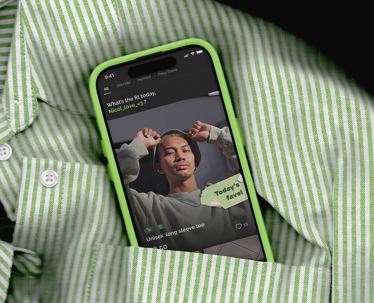
Designing a Functional Swap PlatformUser-centered trift app with a seamless shopping experience.

From user analysis to the final UI, this project was an enjoyable journey in mobile app design. The main goal was to create a functional second-hand/swap app with an easy-to-use interface, while also adding a few modern “Gen Z” elements—especially in the copywriting.

I focused on delivering a quick and effortless shopping experience, balanced with users’ need for safety in online shopping.

At the same time, selling clothes had to feel appealing so that sellers wouldn’t be discouraged. Designing a platform that works smoothly for both buyers and sellers was essential for building a truly functional swap app.

Green Loop - logo
Green Loop - logo variants

Logo and branding.

For the logo, I used a calligraphic typeface where all letters flow into one continuous, looping line. The central idea is built around the letter “e” from the word green: I took its shape and transformed it into the “o” letters in loop. By simply reshaping one character into another, I wanted to highlight the essence of the product: taking something existing, reworking it, and giving it a new purpose.

Logo was created as a vector in Adobe Illustrator and delivered in multiple formats to ensure flexibility in different use cases. Its primary layout is vertical, but I also prepared a horizontal version and a dark variant for future needs, such as alternative backgrounds, branding materials, or responsive layouts.

Green Loop - UI
Green Loop - icons
Green Loop - mockup

UI and design system.

For the visual direction, I went with a popular dark mode that’s easy on the eyes and paired it with bold green gradients to create a modern, energetic vibe. The green symbolizes being alive and outspoken—reflecting clients’ belief that thrifting and upcycling are active ways to care for the environment. It’s an important value for the brand, and we wanted to express it confidently. At the same time, I kept most of the UI intentionally minimalistic to show that design can be clean, calm, and sustainable. For a content and copywriting I focused on a friendly, slightly slangy tone of voice to feel closer to younger users.

I worked with a free icon library to keep the visual language consistent and approachable. For the specific icons I needed, mainly clothing-related symbols for individual categories, I created custom icons in the same visual style.

I created the project using four main tools: branding in Illustrator, wireframes sketched in Procreate, lo-fi layouts prepared in Figma, and photos edited in Photoshop. The complete high-fidelity design, together with the design system, UI library, and variable components for smooth updates and scalable development, was finalized in Figma.

Green Loop - buying process
Green Loop - chat
Green Loop - Figma

App flow.

I focused on creating an easy buying experience with as little time-consuming steps as possible. The flow is strongly inspired by familiar online marketplaces, so users immediately recognize patterns they already know, making the shopping experience smooth and intuitive. UX of the messaging system was intended to make communication clearer for both sides, including visible order states that are easy to distinguish from regular messages, improving overall accessibility and reducing confusion.

I added a notification within the chat to confirm that the buyer’s package has arrived. This helps ensure users always feel informed and shows that a seamless, reassuring shopping experience is a priority.

I included a showcase of all key screens to give a clearer picture of the full app flow.

Green Loop - mockup
Green Loop - billboard
Green Loop - logo
Green Loop - tag

Graphic design.

I created mockups and promotional banners as supporting graphics for social media and advertising. I designed them not only to present the brand in real-world contexts, but also to give a clear example of how to work with the logo, color palette, and overall tone of voice. These visuals help ensure the brand is used consistently across different channels and by anyone who might work with it in the future.

Thank you for taking the time to read through this entire case study. I’m always open to feedback and happy to hear any thoughts that can help me improve.

Green Loop - thank You